
What to Include on Your Therapy Website Home Page
Your home page has one important job… to help the right person decide (within seconds) that they are in the right place. If this page is vague, cluttered, or feels like it was written for nobody in particular, visitors will likely leave before they ever read a word about your services.
A strong, strategic home page is not complicated. It just needs the right pieces, in the right order. Here’s what to include:
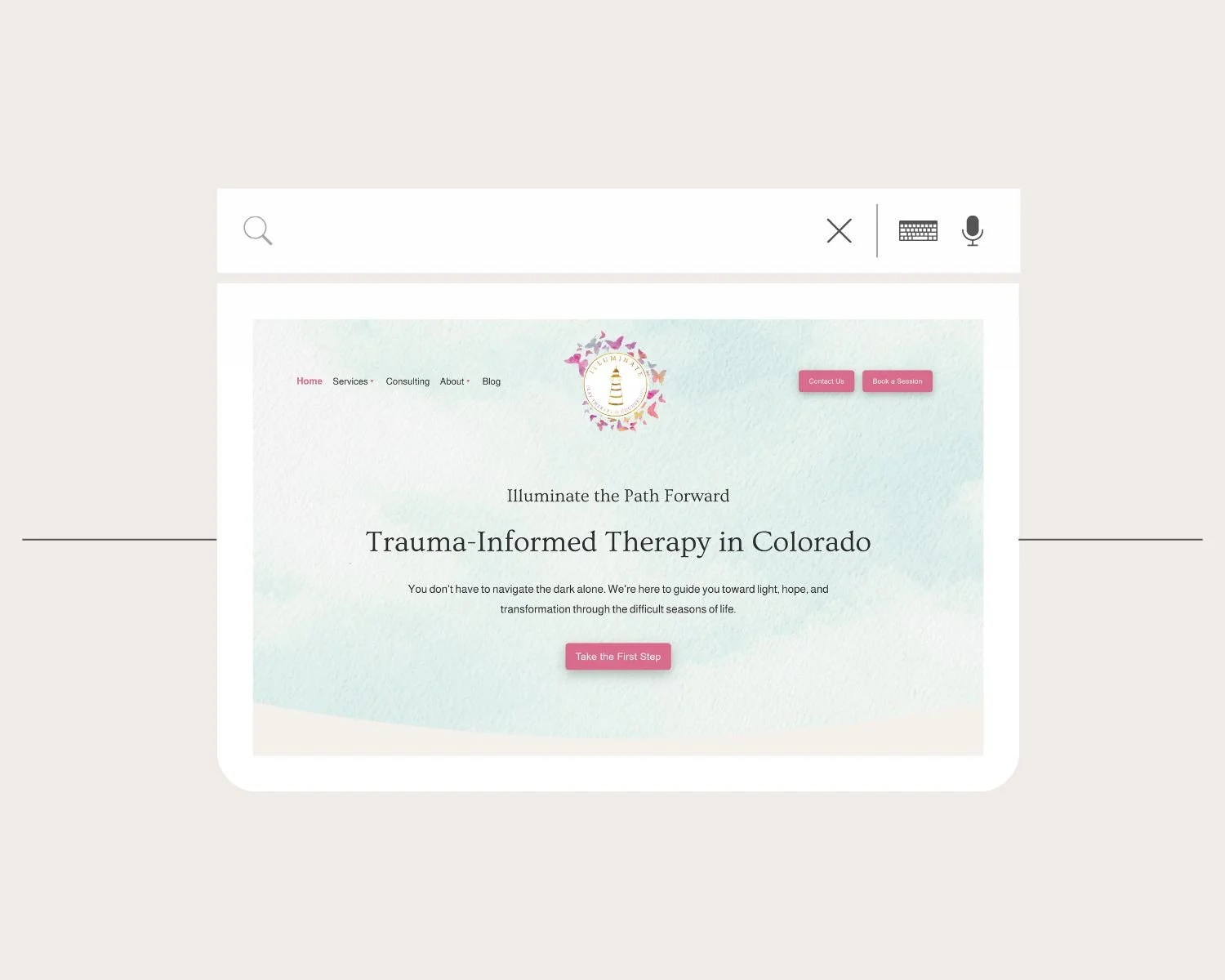
1. A Headline That Says What You Do and Who You Help
The very first thing someone sees when they land on your website should answer two questions immediately: What do you do? And who do you do it for?
Keep it clear, specific, and focused on your ideal client. “Welcome To My Practice” doesn’t really tell visitors anything. Opt for something more descriptive like, “Helping Women in Philadelphia Heal From Anxiety & Burnout”. This tells potential clients the most important info about you right up front. If they have to scroll or squint to figure out whether you can help them, they’re already halfway out the door.
2. Copy That Speaks to Where Your Client Is Right Now
Once someone knows they’re in the right place, the next section of your home page should make them feel seen. This is where you speak directly to the experience they’re living.
Think about what brings someone to your website in the first place. They may be overwhelmed, stuck, or struggling with something they haven’t been able to shake on their own. Naming that experience signals to them that you understand what they’re going through.
That said, this isn’t about listing symptoms like a brochure; it’s more about using language that reflects their feelings back to them. The goal is for your ideal clients to read your home page and think, “This person gets it!”
3. A Vision of What Is Possible
After you’ve acknowledged where your potential client is right now, help them imagine where they could be. What does life start to look like when the thing they’ve been carrying begins to lift?
This doesn’t need to be dramatic or overly poetic, just grounded and honest. What do your clients start to notice after a few months of working with you? What shifts? What opens up?
When you can articulate that vision clearly, you’re giving someone a reason to keep reading and, eventually, a reason to reach out.

4. A Brief, Human Introduction to You
People want to know who they’re going to be working with. As they scroll down your home page, they should eventually come to a short introduction to who you are.
This isn’t a credentials section. Your degrees and licenses absolutely matter, and there’s a place for them on your about page. But on your home page, people just want to know what it’s actually like to work with you. What’s your approach? What do you care about? What makes you the right fit for the person you’re trying to reach?
A warm, genuine introduction that reflects your personality builds trust faster than a list of acronyms. Include a professional photo that feels like you, and link to your full about page so people can click to learn more.
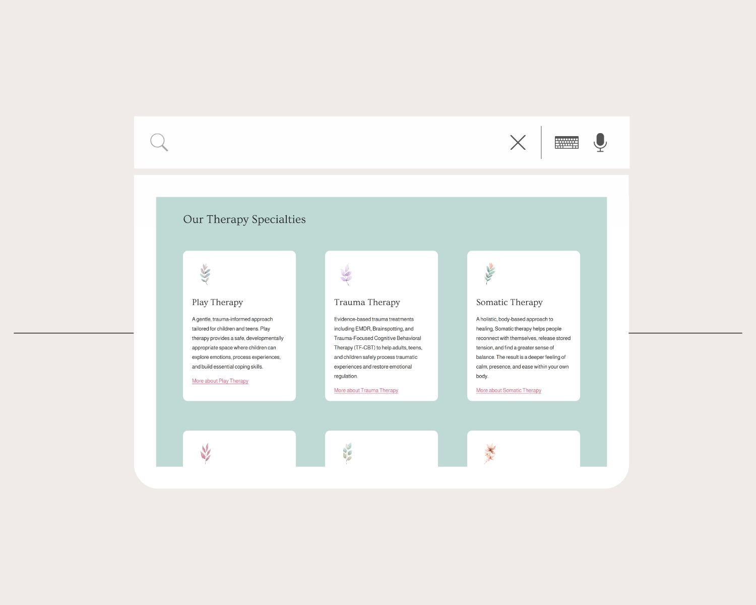
5. A Snapshot of Your Services & Specialties
Your home page does not need to be an exhaustive menu of everything you offer. What it does need is a clear, scannable overview so that visitors can quickly confirm that your work is a fit for what they’re going through.
This might look like a short list of your specialties (anxiety, trauma, life transitions, relationship issues) or a brief summary of the types of therapy you offer (individual sessions, EMDR, couples work). Either way, the goal is to give someone enough to recognize themselves in your work, and then point them toward a dedicated specialty page to learn more.
Think of it as a preview, not the full story.
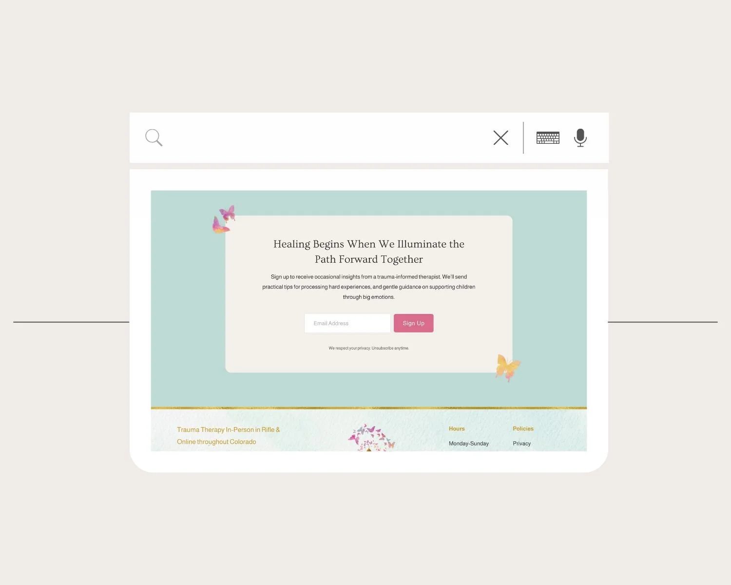
6. Clear Calls to Action Throughout
A beautiful website with no clear next step is still a website that does not convert.
Every section of your home page should give visitors a natural path forward. That might mean a button to learn more about your approach, a link to your services page, or a clear invitation to book a consultation. You don’t need to be pushy, you just need to make the next step obvious.
The most important call to action is the one at the very bottom of your home page. Do not leave someone at the end of the page with nowhere to go! A simple, direct “Book a free consultation” is often all it takes to gently guide visitors to take action.
7. Visuals That Match Your Brand
This is the reason most therapists come to me requesting a website redesign. Your home page visuals, including your colors, fonts, and photos, create an immediate impression before a single word is read. If these elements feel mismatched, generic, or like they belong to a different kind of business, visitors may not be able to name what is off, but they’ll certainly feel it. When your visual identity is consistent and intentional, it reinforces the trust your words are working to build.
This doesn’t mean you need a full brand overhaul to get this right. You just need clarity on your colors, a consistent font pairing, and photos that actually represent you and the work you do. This can feel a little overwhelming to figure out, but it’s worth the effort! This is why I walk clients through a very detailed questionnaire before we touch a single design element. It helps surface the visual direction that already exists in how you think about your practice, even if you’ve never put it into words before.
Putting It All Together
A strong therapy website home page is not about having the most content. It’s about having the right content, organized in a way that moves your ideal client from “I found this site” to “I want to reach out.”
If you look at your current home page and any of these pieces feel shaky or missing, that’s exactly where to start. And if you find you need some help along the way, book a free web design consultation to see how we can work together to improve your home page and build an online presence that reflects the practice you’ve worked so hard to create.


