
Minimalist Website Design for Therapists
As a therapist, the environment you create — whether in person or through your website — shapes how clients experience your work. Your office is likely designed to make clients feel safe, calm, and focused. Your website should do the same.
If your current site feels cluttered or overwhelming, it might be time to explore a simpler, more intentional approach. Minimalist website design can result in a digital space that feels clear, grounded, and inviting.
So, what is minimalist web design?
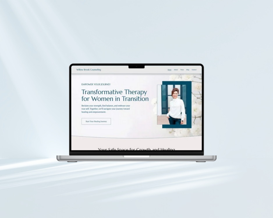
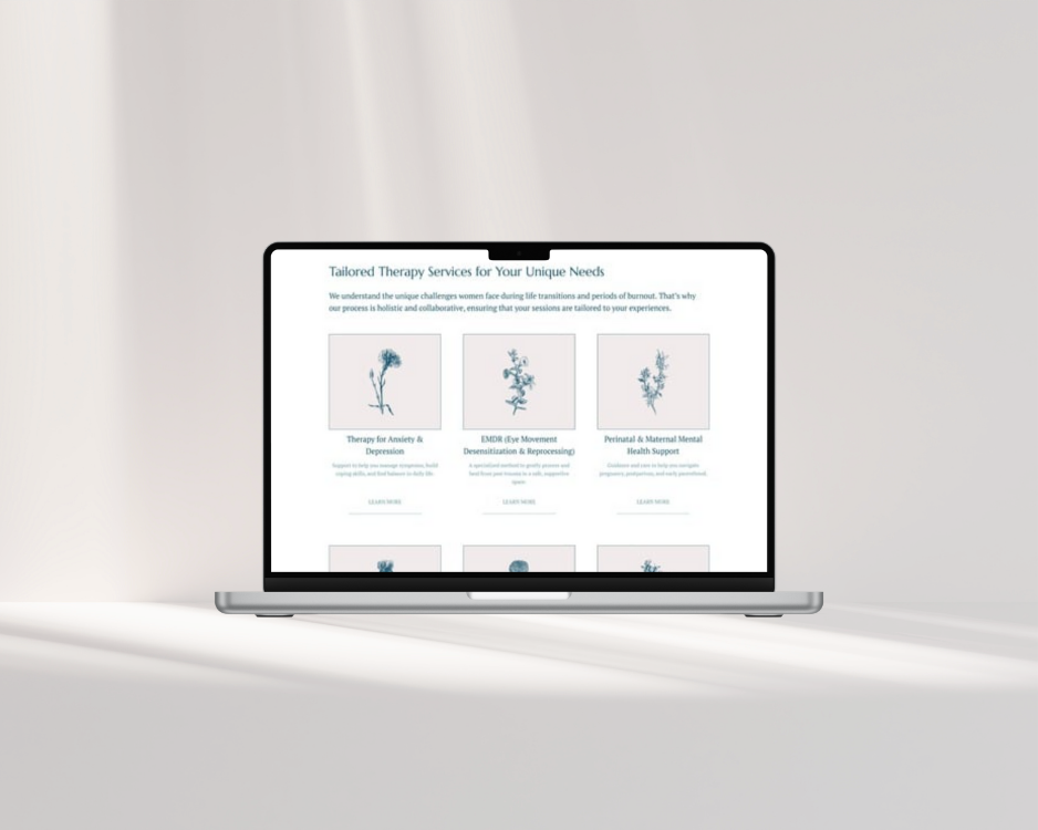
Minimalist design is the art of doing more with less. It focuses on clean layouts, generous white space for plenty of breathing room, simple color palettes, and purposeful typography. Every element serves a function so that nothing extra distracts from the message.
Won’t a minimalist website feel boring?
Not at all! Rather than feeling bare or impersonal, minimalist websites feel peaceful and trustworthy. They invite visitors to slow down and focus on what really matters: the connection between therapist and client.
When done right, minimalist design can feel sleek, mindful, and intentional.
Why are therapists choosing minimalist designs?
Therapists are naturally drawn to minimalism because it mirrors their professional values like clarity and presence. A minimalist design allows your message and personality to shine through without unnecessary noise.
When potential clients land on your site, they’re often experiencing anxiety, stress, or uncertainty. A simple, visually balanced layout helps calm their minds.
How does a minimalist website reflect a therapist’s values?
A minimalist website design communicates integrity and authenticity. Instead of relying on flashy visuals, it shows calm self-assurance in your work and message. For therapy practices built on trust and compassion, this subtle confidence goes a long way.
Minimalism also demonstrates an awareness of what’s essential and what isn’t. When your website mirrors that intention, clients feel it.

How can minimalist design help clients feel more at ease?
The experience of visiting a minimalist website can feel like taking a deep breath. There’s space to rest the eyes, absorb information, and reflect — all without distraction.
Soft colors, thoughtful imagery, and gentle typography choices evoke calm and trust. This emotional experience sets the tone for the client’s journey with you, even before they reach out.
Why does minimalism fit so naturally with the mental health field?
The principles of minimalism — clarity, presence, and purpose — align naturally with the work therapists do. A simple layout reinforces your professionalism, while strategic use of space and color encourages calm reflection. This in turn supports accessibility, inclusivity, and emotional balance — values deeply connected to mental health.

But will minimalist design support my marketing goals?
A minimalist website isn’t just beautiful — it’s strategic and can even strengthen your marketing.
Improved Readability
Simpler layouts make your content easier to digest.Faster Loading Times
Fewer design elements mean your site loads quickly, improving SEO and user experience.Clear Calls-to-Action
When there’s less visual clutter, your “Book a Consultation” button stands out.Better Alignment with Your Brand
A minimalist site signals calm confidence, aligning with the qualities clients look for in a therapist.

Can minimalism improve website accessibility?
Accessibility is an essential part of modern web design — and minimalism can work in its favor. Clean layouts, clear typography, and strong color contrast help ensure your website is usable by everyone, including those with visual or cognitive differences.
When your site is both beautiful and accessible, you send a powerful message that everyone deserves to feel welcome and seen.
How can I apply minimalism to my existing therapy website?
You don’t need to start from scratch to embrace minimalism. Try these simple adjustments:
Simplify your navigation: Keep menu items clear and essential - not cluttered.
Choose a calm color palette: Neutral tones and soft accents foster peace and focus.
Add white space: Give your content room to breathe.
Use high-quality, authentic imagery: Photos that feel warm and natural resonate most.
Streamline your copy: Speak simply and directly, just as you would in session.
With the right balance, your site will feel as centered and grounded as the work you do.

How do I get started with a minimalist redesign?
When designed with mindfulness and simplicity, your website becomes an extension of your practice. If you’re ready for a site that feels calm, authentic, and aligned with your values, I can help. Book a free consultation.
Related Posts


