
Brand Identity For Health & Wellness Businesses
Let’s explore what brand identity really is, why it matters (especially for therapists and wellness professionals), and how to start creating your own brand identity that feels calm, clear, and true to your practice.
So, What Is Brand Identity?
Your brand identity is the visual and emotional language your business communicates through your logo, typography, color palette, imagery, and the overall feeling these elements create.
It’s how clients instantly recognize you online. It’s also how they gain a sense of who you are before ever reading anything about you.
For service-based businesses — especially therapy and wellness — brand identity is more than just visuals. It’s about helping visitors feel safe, seen, and at ease from the moment they land on your website.
Why Brand Identity Matters for Therapists & Wellness Practitioners
Your clients are often in vulnerable or transitional moments of life. When they’re looking for support, they are drawn to brands that feel calm, grounded, trustworthy, and aligned with their values.
A cohesive brand identity:
1. Builds trust
A clear, consistent brand helps potential clients feel that you’re professional, organized, and intentional — three qualities that matter in the “helping” professions.
2. Helps clients self-select you
The right visuals communicate your personality and the type of clients you love working with. Soft neutrals, for example, may signal a calm and grounding space; bold colors might signal a more dynamic, energetic approach.
3. Differentiates your practice
There are many therapists and wellness businesses out there. A thoughtful brand identity helps you stand out in a meaningful, authentic way — without feeling salesy.
4. Creates a cohesive client experience
When your website, social media, forms, handouts, and business cards all match, clients feel a sense of continuity and care.

Core Elements of a Strong Brand Identity
Below are the foundational pieces of a brand identity. Each of these should intentionally reflect the experience you want clients to have while working with you.
Logo
A logo doesn’t need to be complex.
In fact, simple logos often read as more professional and timeless. Your logo should communicate the tone of your practice (calm, warm, grounded, creative, etc.) at a glance.
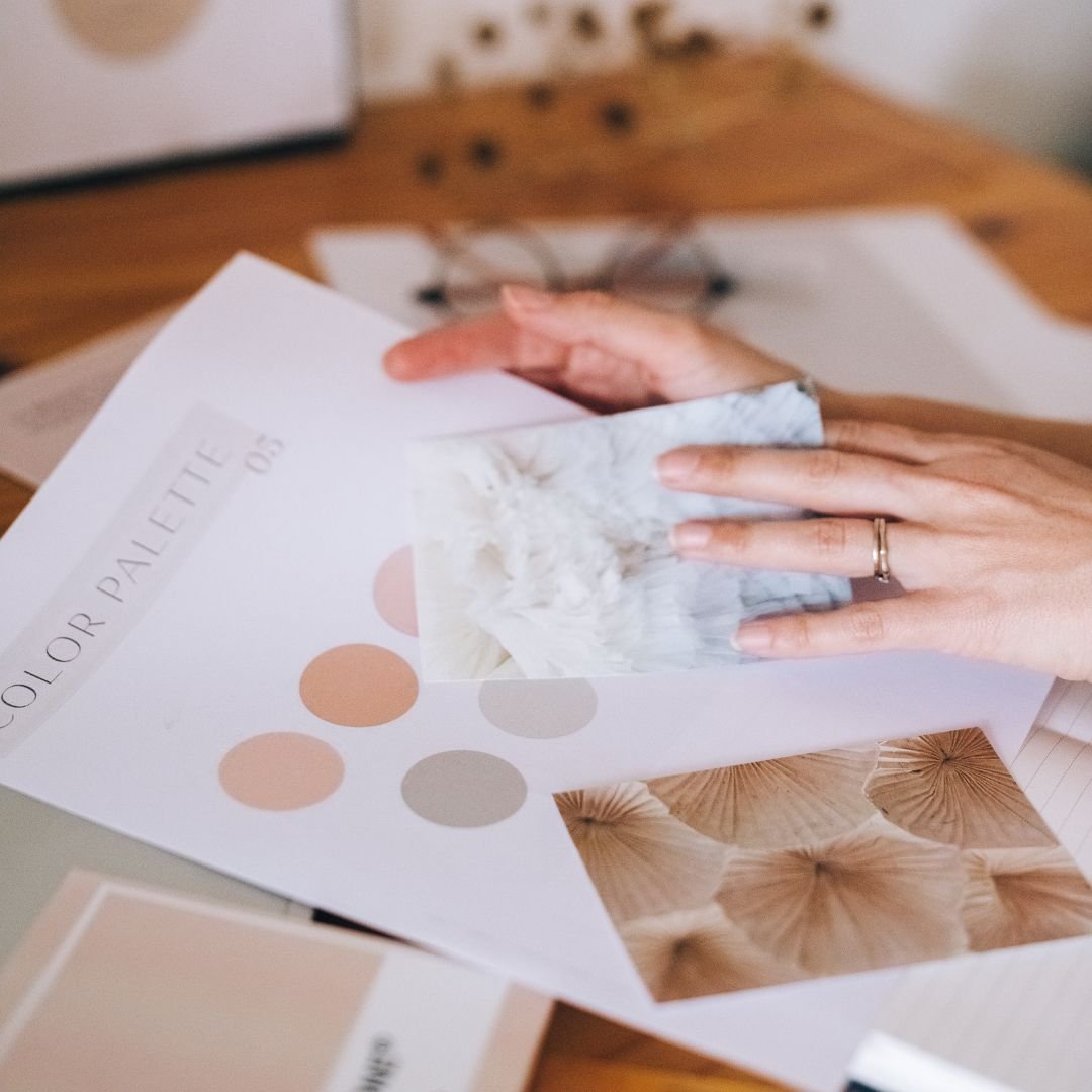
Color Palette
For therapy and wellness brands, calming blues, greens, earth tones, and soft neutrals are often used to create a sense of trust and safety — but you should choose colors that genuinely reflect your personality and approach.
Typography
Fonts influence how your brand is perceived.
A serif font can feel warm, traditional, and grounding.
A clean sans-serif font feels modern, friendly, and accessible.
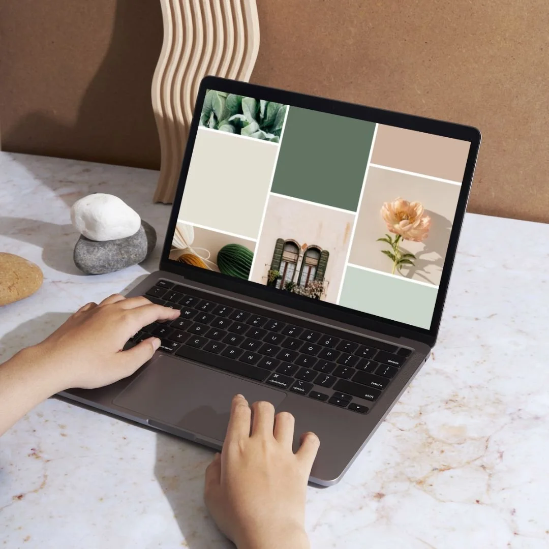
Imagery & Photography
Photos and graphics bring your brand to life.
Choose imagery that feels natural, warm, and aligned with the emotions you want your clients to experience.
Creating a Brand Style Guide (Your Roadmap for Consistency)
A Brand Style Guide is a document that outlines your:
logo variations
color palette
typography
photography style
voice + tone guidelines
spacing + layout preferences
examples of how your brand should be used
This guide becomes your North Star for consistency. Whether you're posting on Instagram, updating your website, or sending a newsletter, your style guide ensures everything feels unified. Why does this matter? Consistency builds recognition. And recognition builds trust.

Does Your Brand Identity Need a Refresh?
You may need to revisit your brand identity if:
Your website feels outdated or doesn’t reflect who you are anymore
Your visuals feel inconsistent or mismatched
You’ve grown professionally (new niche, new services, new direction)
You’re embarrassed to share your website
You're ready to scale and want a more professional presence
If any of these resonate, a refresh can bring clarity, confidence, and renewed energy to your business.
Brand Identity in Action: A Quick Example
Imagine a trauma therapist who describes their work as “warm, grounding, and deeply supportive.” But their website uses bright jewel tones, busy fonts, and stock images that don’t match their approach.
Visitors might feel visually overwhelmed — an immediate disconnect.
Now imagine that same therapist using:
soft greens and neutrals
spacious layouts
calming nature imagery
a clean serif font
a logo that feels gentle and organic
That cohesive identity creates a space where clients instantly feel safe, calm, and welcomed. That’s the power of intentional design.
Common Mistakes to Avoid
Here are pitfalls I often see in DIY brands:
Using too many colors or fonts
Choosing trendy visuals that don’t age well
Inconsistent imagery across different platforms
Not considering how colors and typography affect emotion
Skipping a Brand Style Guide
These mistakes can dilute your message and confuse potential clients — but they’re simple to fix with the right guidance.
Your Path to a Polished, Professional Brand
A thoughtful brand identity doesn’t just happen by accident — it comes from clarity, intention, and the right creative guidance. Working with a talented branding specialist can help you create a cohesive, professional presence that truly reflects who you are. But if you're not ready for a full branding package, I offer a Mini Visual Branding Kit add-on that gives you everything you need to get started: a complete logo set (main, secondary, submark, and browser favicon), a Mini Style Guide with fonts and a calming, intentional color palette, and a custom mood board to help you stay consistent. It’s a simple, supportive way to elevate your brand — and create a visual identity that feels aligned, grounded, and beautifully you.
Click here to schedule a free discovery call.
Let’s create a brand identity that helps your ideal clients feel instantly at home.
Related Posts


