What does it take for someone to reach your contact page? They find your website, read through your about page, maybe spent time on a few specialty pages, and then decided that you might be the right person to help them. That’s no small thing; getting to your contact page took some intention.
When a client lands here, you don’t want them to find a page with no guidance, no warmth, no reassurance. If there’s no clear explanation of what happens next, potential client will pause, probably feel a little unsure, and close the tab.
Instead, use your contact page as an opportunity! When designed thoughtfully, it can be a hardest-working page that converts visitors into inquiries, sets clear expectations, answers common questions (before they have to ask!), and quietly saves you hours of back-and-forth.
Here’s how to build one that does all of that.
Your Contact Page Is a Conversation, Not a Form
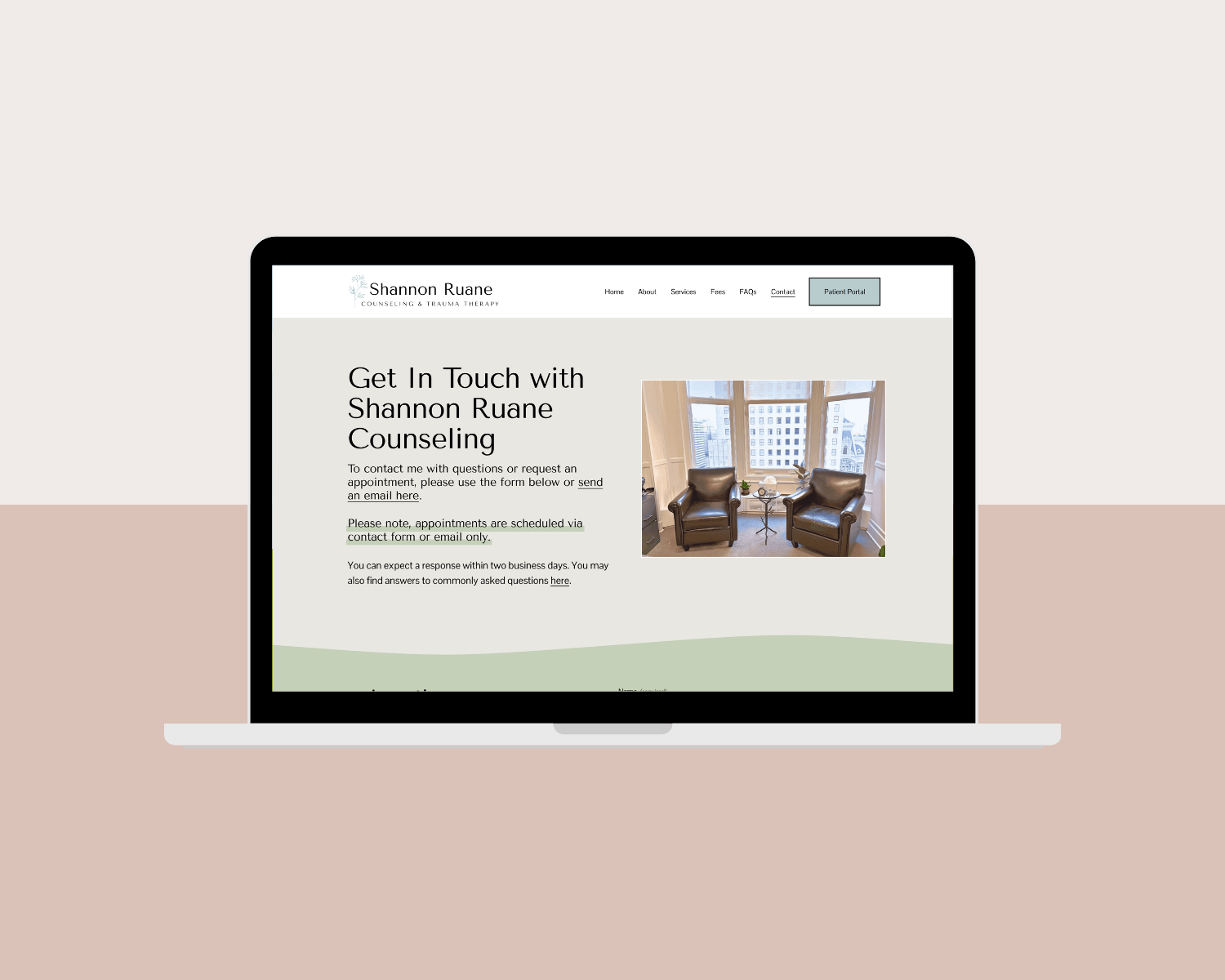
The most common mistake people make with their contact page is treating it like a formality. Something that just has to exist so people can send a message. But your contact page is actually a continuation of the conversation your whole website started.
Someone who has made it this far is already leaning toward reaching out. Your contact page should meet that energy with warmth and clarity. It should feel like the natural, comfortable next step, not a cold transaction.
That starts with the copy above your form. Instead of a heading that just says Contact, consider something that acknowledges where your visitor is and encourages them forward. Something like “You’ve already taken the hardest step. Reaching out is the next one.” Or simply: “I’d love to hear from you. Fill out the form below and I’ll be in touch within two business days.”
A short, warm introduction above your form does more work than people realize. It reduces anxiety, signals that a real human is on the other end, and makes the whole experience feel less clinical.
What to Actually Put on Your Contact Form
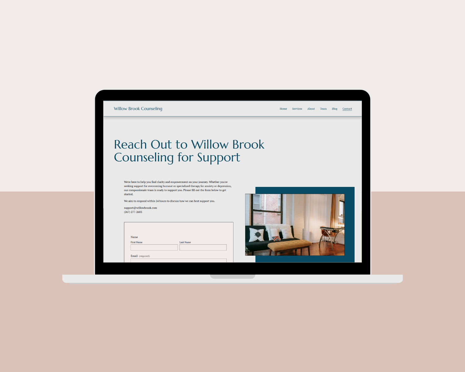
This is where thoughtful design can genuinely save you time. A contact form that collects the right information upfront means fewer back-and-forth emails before you can even determine whether this person is a good fit for your practice.
Here’s what a well-designed therapy contact form typically includes:
The Basics
Start with the essentials: name, email address, and phone number if you use calls as part of your intake process. Keep it simple.
What They’re Looking For
A dropdown menu of your services works great here. Most built-in website forms, including those on Squarespace, are not encrypted to HIPAA standards. You don't want to use them to collect any Protected Health Information (PHI), therefore it’s best to skip the intake questions here.
Compliance Tip: Include a disclaimer such as: "We are committed to your privacy. This form is for general questions or requesting an appointment. Please do not include confidential or private information regarding your health in this form."
Availability or Scheduling Preferences
If you have limited session slots or specific availability, a simple checkbox or dropdown asking about preferred days or times can save multiple rounds of scheduling emails. Even a question like “Are you looking for in-person, virtual, or either?” can help you quickly determine whether this inquiry is workable before you spend time responding in depth.
How They Found You
This one is for you as much as it is for them. Knowing whether someone found you through Google, Psychology Today, a colleague referral, or Instagram helps you understand what’s working in your marketing. A simple dropdown gives you genuinely useful data over time.
The goal is not to make the form long. The goal is to make it smart. A form that asks the right four questions tells you far more than an open text box, and saves you from emailing back and forth three times before a consultation even happens.
The FAQ Section That Saves You Hours
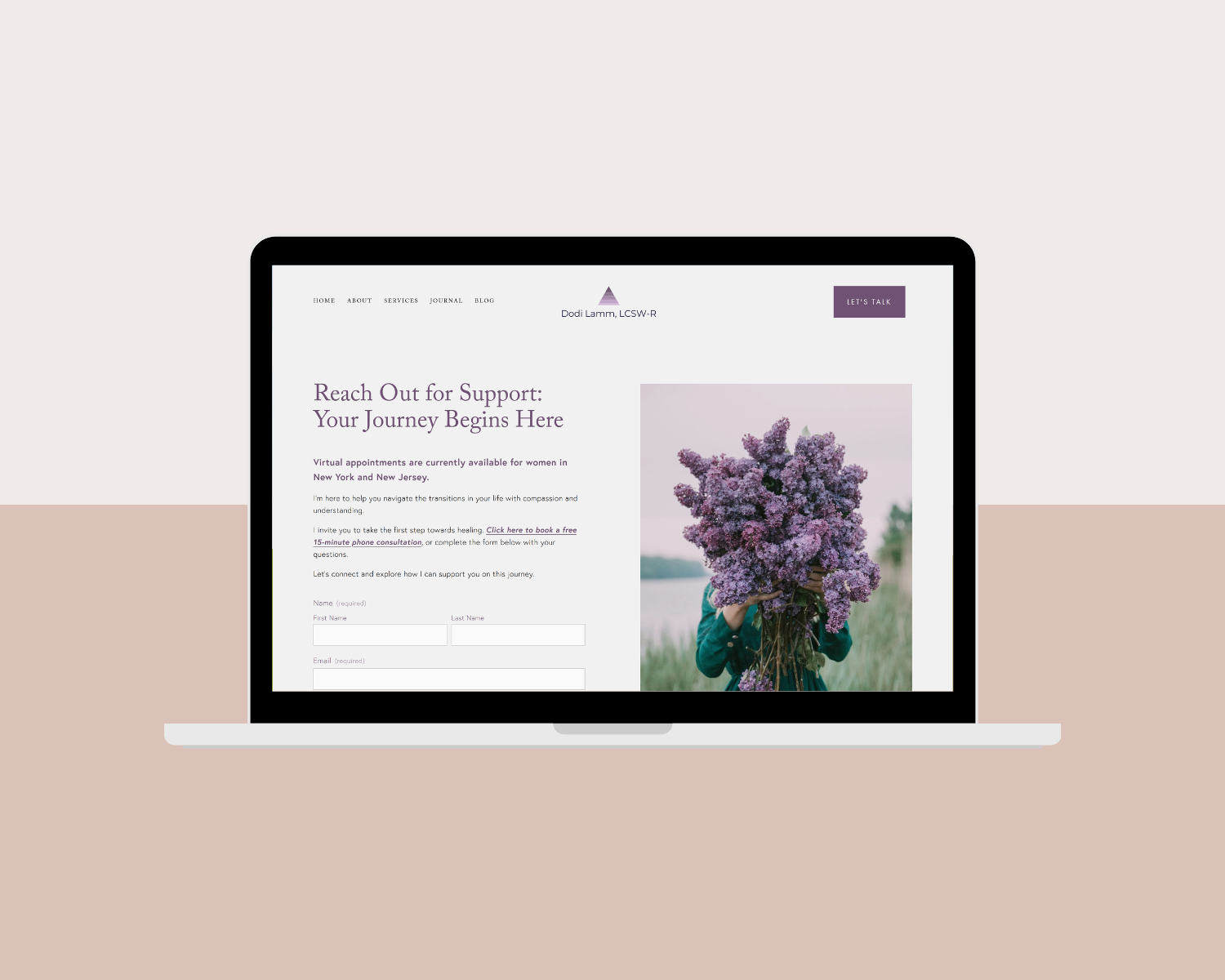
Including a short FAQ section directly on your contact page is a strategy that can save you hours!
Think about the questions you answer repeatedly in those first emails or consultation calls. What are your fees? Do you take my insurance? How long are sessions? Are you currently accepting new clients? What does the first session look like? Is therapy right for me? Do you offer a free consultation?
Every one of those questions represents a round of back-and-forth communication that your contact page could have answered in advance. When you address the most common questions right there alongside your form, potential clients arrive at your consultation already informed. They’re not emailing to ask basic logistics, and instead, they’re reaching out because they want to work with you.
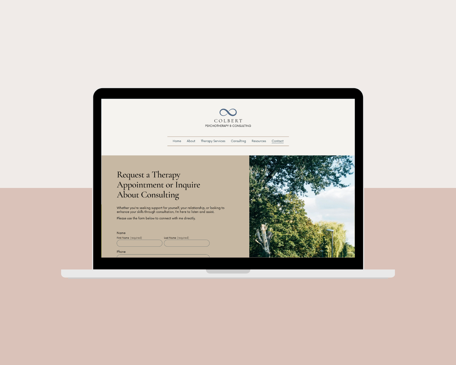
Set Expectations Clearly
Another simple, yet much appreciated thing you can do on your contact page is tell people exactly what happens after they hit submit.
Something as brief as “I respond to all inquiries within two business days. If you don’t hear back, please check your spam folder or feel free to email me directly at [your email].” might seem like a small detail, but it makes a meaningful difference to someone who might be nervous about reaching out.
That brief note accomplishes several things at once: it sets a clear timeline so they aren’t left wondering, offers an alternative when technology fails, and signals that you’re organized, communicative, and respectful of their time… all of which builds trust.
Design Details That Make a Difference
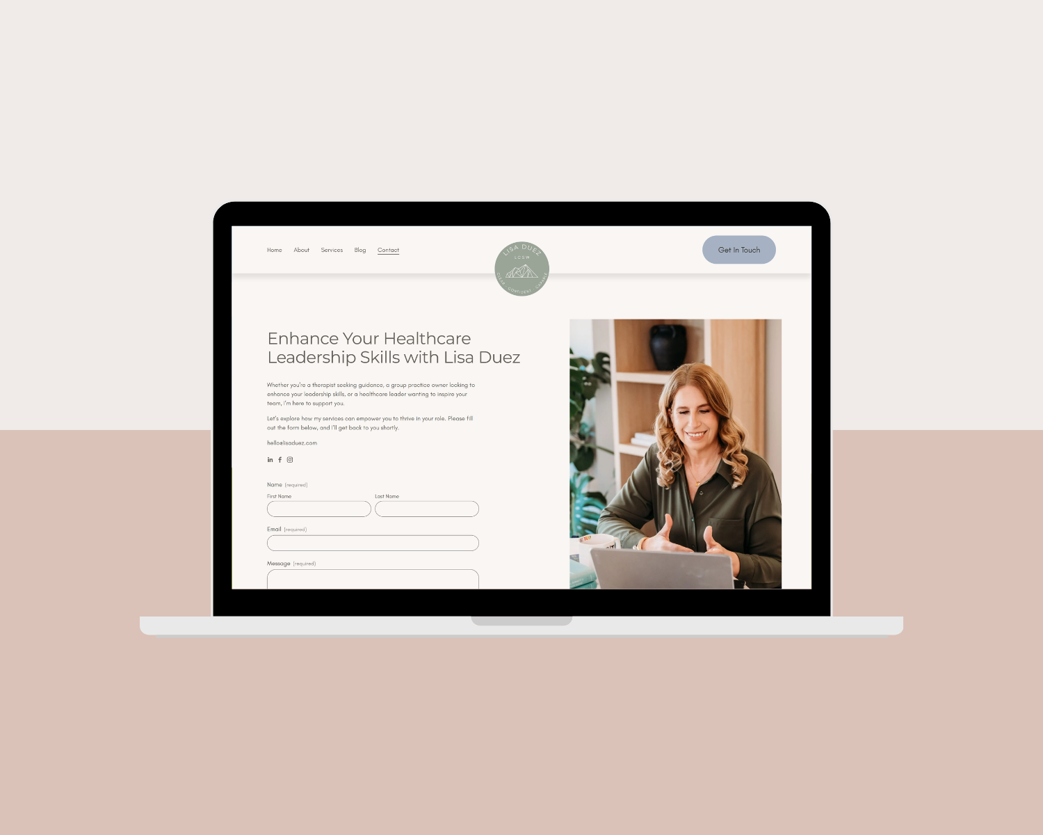
The words on your contact page matter enormously, but of course, so does the visual experience. A few design elements that are worth getting right:
Keep It Clean & Uncluttered
Your contact page is not the place to add more information about your services. By the time someone reaches this page, they’ve already done their reading. A clean, calm layout with your form, a short intro paragraph, and your FAQ section is all you need. White space is your friend here — think breathing room!
Make It Mobile-Friendly
A significant number of people searching for a therapist are doing it from their phones, often in a private moment during a commute, a lunch break, or late at night when they’ve finally decided they’re ready. Your form should be just as easy to complete on a small screen as it is on a desktop.
Functionality Tip: Mobile view is great in Squarespace and other website platforms, but nothing beats testing everything yourself directly on your phone.
Include a Direct Email or Phone Number
Some people just aren’t comfortable with forms, or may have a specific question they want to ask before they fill one out. Offering a direct email address alongside your form gives those visitors another path forward and signals that you are accessible.
Use a Confirmation Message That Feels Human
When someone submits your form, the confirmation message they see should feel personal, not automated. Instead of “Your form has been submitted.” try something like: “Thank you so much for reaching out. I’m really glad you did. I’ll be in touch within two business days. In the meantime, feel free to browse my free mental health resources here.” with a link to your blog or other resources.
Embed a Map
If you see clients in-person, it’s a good idea to include your office address and embed a map. This helps potential clients feel more confident about finding your space and supports local SEO. Keep the map lower on the page or alongside your office details so it complements the design without overwhelming it. Include a short note with any applicable info about parking, building access, or what clients should expect when they arrive to help ease first-visit anxiety.
SEO Tip: Instead of using Squarespace’s built-in map block, embed a Google Map directly on your page. Both options are clickable for easy navigation, but an embedded Google Map can provide stronger local SEO benefits.
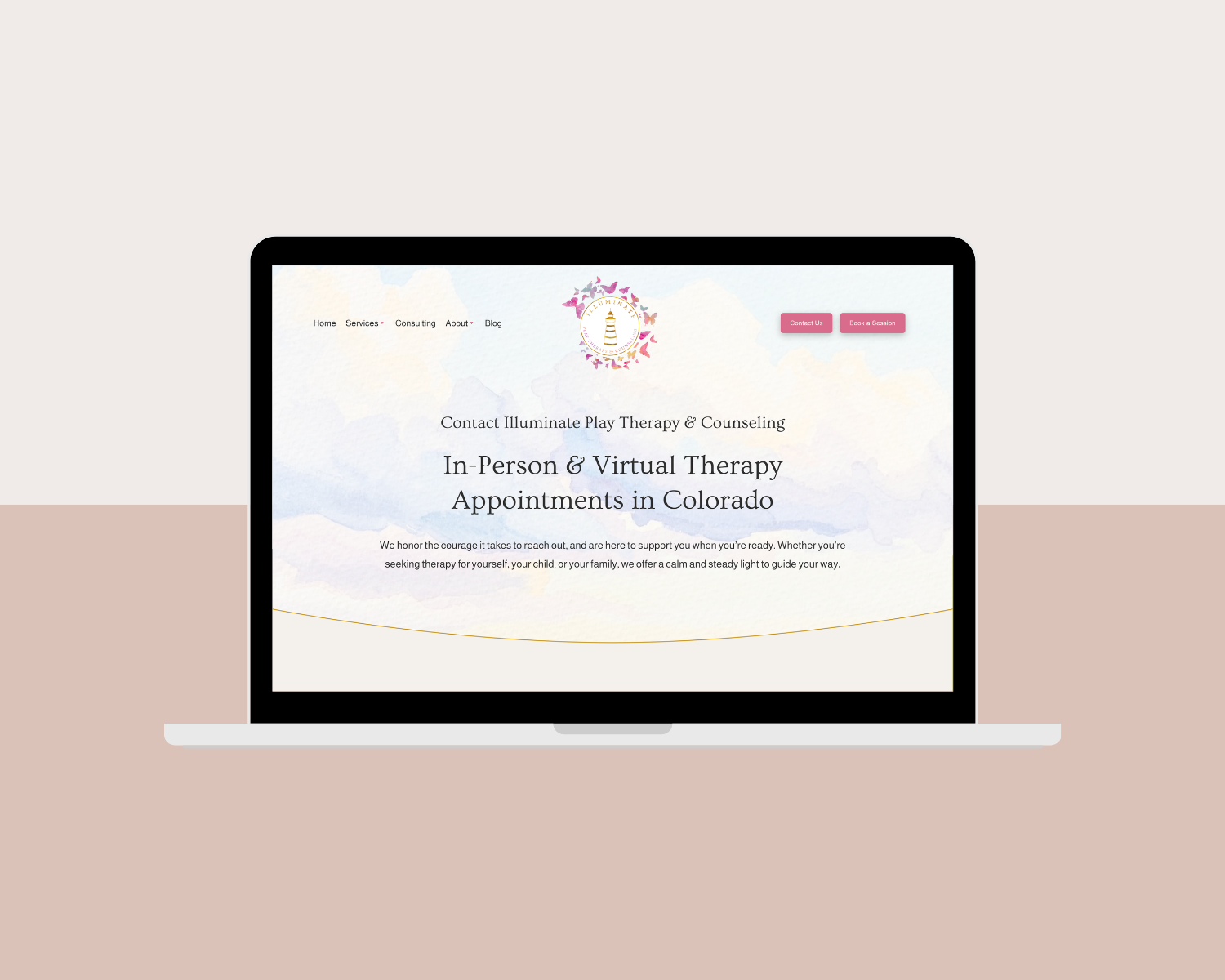
A Contact Page That Works As Hard As The Rest Of Your Website
With the right structure, the right questions, and a little bit of warmth, your contact page can turn visitors into inquiries, and save you hours of administrative work along the way.
If your current website isn’t doing that work for you, or if the whole thing just doesn’t feel like you, this is exactly what I help therapists and wellness professionals with. I design custom Squarespace websites that feel inviting, clear, and true to your practice, from the home page and about page, all the way through to the 404 page and contact page. Reach out to learn more or schedule a free consultation.